← Back to Blog

The Story Behind The Memory Palace Logo: How a Podcast Became a Design

The Memory Palace logo transforms a simple keyhole into a gateway to forgotten stories. Discover the meaning behind its stars and silhouette, and why it resonates with history fans.

The Origin of The Memory Palace Podcast

Nate DiMeo launched The Memory Palace in 2008, a podcast that transforms forgotten historical moments into intimate, poetic narratives. The show's name refers to the ancient mnemonic technique of a "memory palace" - a mental landscape where memories are stored as vivid images. DiMeo's stories are exactly that: miniature palaces crafted from archives, diaries, and artifacts, inviting listeners to step inside and experience history as an emotional, sensory event. The podcast quickly gained a devoted following among history lovers who craved narrative depth over dry facts.

By the early 2010s, The Memory Palace had become a touchstone for narrative podcasts, praised for its lyrical writing and DiMeo's warm, measured voice. The show's identity was inseparable from its content - intimate, curious, and beautifully simple. When it came time to create official merchandise, the challenge was to distill that ethos into a single visual mark.

How the Logo Was Designed

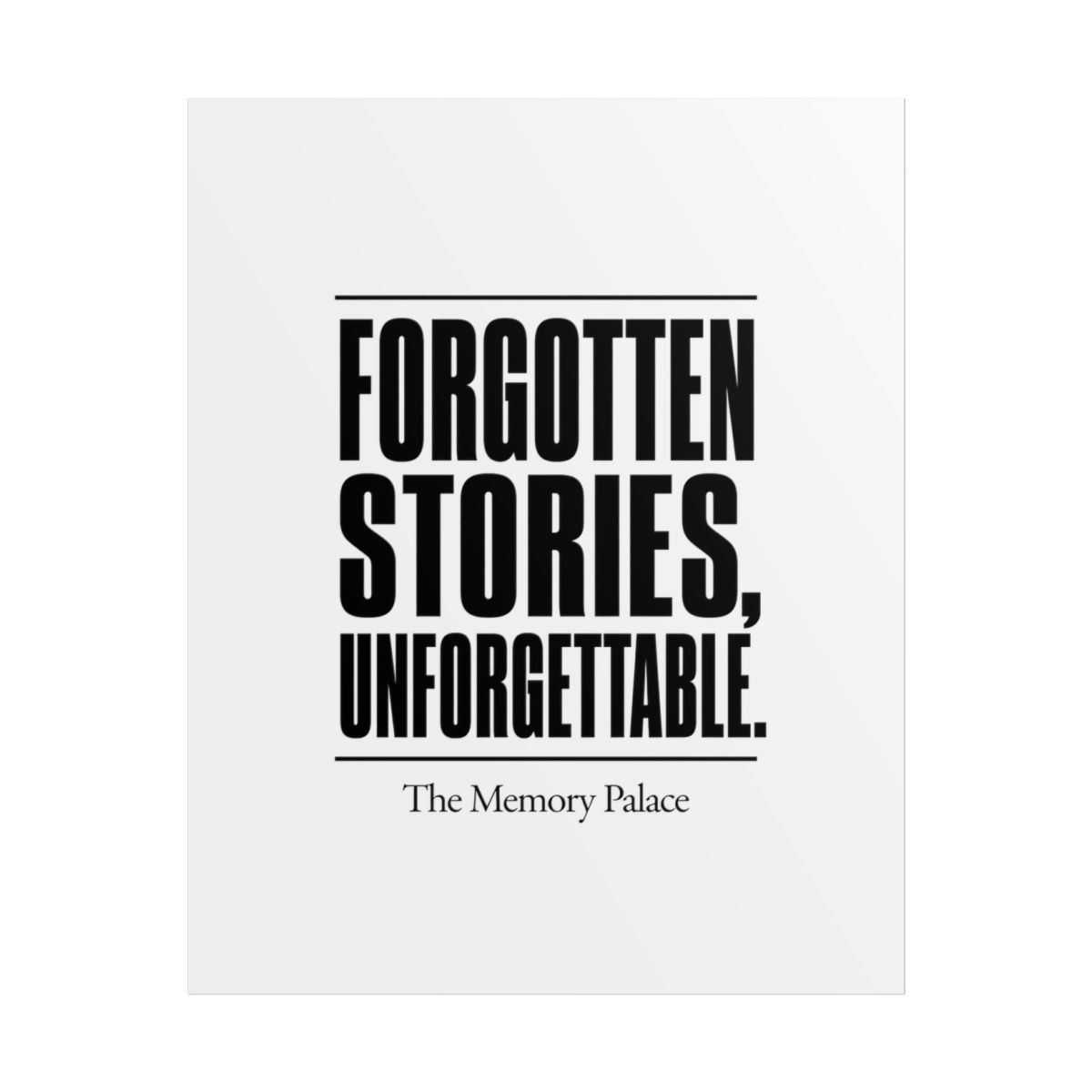
The logo was a collaborative effort between Nate DiMeo and a small group of designers who understood the podcast's aesthetic. Early sketches explored doors, windows, and architectural details - motifs that echoed the "palace" concept. The final design settled on a keyhole shape, but not just any keyhole. The logo features a simple, rounded keyhole with a starry night sky visible through the opening. The sky is dotted with stars of varying sizes, suggesting the vastness of history and the countless stories waiting to be unlocked.

The typography uses a classic serif font, reminiscent of old books and printed ephemera. The word "Memory" is slightly larger than "The" and "Palace," drawing the eye to the core concept. The color palette is minimal: deep navy blue for the background, gold or white for the keyhole and text. This combination evokes a sense of timelessness and treasure - as if the logo itself is a artifact you might find in a dusty archive.

Symbolism in the Logo Elements

Every element in The Memory Palace logo carries meaning. The keyhole is the most obvious symbol: it represents a gateway. In the context of the podcast, it is the invitation to peek into the past, to unlock a story that has been sealed away. The stars inside the keyhole are not random; they represent individual stories, each one a point of light in the dark expanse of history. The night sky suggests that history is not a bright, well-lit museum but a vast, mysterious space where most stories remain undiscovered.

The shape of the keyhole itself is rounded and soft, not sharp or industrial. This softness mirrors DiMeo's storytelling style - gentle, inviting, never harsh. The lack of a key in the logo is intentional; the listener does not need a literal key to enter. The key is curiosity. The logo says: look through this opening, and you will find something worth remembering.

Fan Interpretations and Theories

Over the years, listeners have developed their own readings of the logo. Some see the keyhole as a memory palace itself - a small building with a door. Others interpret the stars as the memories of the dead, glowing faintly. A popular theory among fans is that the keyhole represents the moment when a forgotten story is rediscovered: the flash of light when you finally see what was hidden.

One fan noted that the logo resembles a pinhole camera, an early device for capturing light and images. This aligns with the podcast's mission to capture fleeting historical moments. Another listener pointed out that the stars seem to form a loose constellation, perhaps representing the interconnectedness of historical events. These interpretations show how the logo, like the podcast, invites active engagement and personal meaning.

Where to Find the Logo on Merch

The Memory Palace logo appears on official merchandise including t-shirts, tote bags, mugs, and enamel pins. The logo is often placed on the chest or center, allowing it to act as a conversation starter for fans. T-shirts come in navy, black, or cream, with the logo in gold or white. Mugs feature the keyhole on one side and the starry sky wrapping around - so you can see the stars as you drink. The enamel pin is a small, detailed replica, popular among collectors.

Limited-edition items sometimes use alternate colors - a burgundy keyhole on a tan shirt, for example - but always retain the same composition. The consistency of the logo across products ensures that every piece feels like part of the same universe, whether it is a sticker or a hoodie.

Why the Logo Resonates with History Fans

History fans are drawn to the logo because it does not shout. It whispers. It acknowledges that history is not a series of grand monuments but a collection of small, intimate moments. The keyhole invites you to look closer, to lean in - much like the podcast itself. The starry sky reminds us that the past is infinite, and every story we uncover is a tiny light in the darkness.

Moreover, the logo avoids clichés of ancient scrolls, quills, or hourglasses. Instead, it offers a fresh metaphor: memory as a keyhole view of the cosmos. This resonates with listeners who appreciate that history is not static; it is alive, waiting to be unlocked by curiosity. The logo has become a badge for those who believe that the past matters, and that its stories deserve to be told with care and beauty.

Ready to explore more? Check out The Memory Palace merch store to find your own piece of this design.

Related Posts

Shop The Memory Palace Merch

Official merchandise — premium quality, designed for the community.